
Club House App Redesign
- Reza Badarudin

- Apr 1, 2021
- 4 min read
Updated: Apr 26, 2021

What is Clubhouse?
Clubhouse is an ‘invite only’ audio drop-in social media app. The easiest way to explain this app is a good mix of Zoom call, online seminar, and facebook. Communication between users happen in the form of live group voice chat, and interaction between users rely less on the textual or graphical contents. This app curates ‘the power of community’ by allowing users to create rooms and clubs based on interests.
UX Challenges
I spent a few months exploring the app and involved in certain rooms. I found there are certain characteristics of this new form of social media platform that are unique.
Complex Information Architecture

One of the most prominent characteristics is the complex information hierarchy for the app. There are 3 levels of entity: People, Clubs and Rooms. Club (similar to facebook group) held rooms for members and non-members to join in the scheduled time. Each entities represented by profile picture, account names, bio and other analytical information. (e.g. followers, people in the room, room time, etc.) Often, I found users wrote long bio, club and room description. In certain clubs have a really long bio with various informations contained inside the page. Emoji and manual layout-ing has been the ‘visual hero’ in the bio page that helps other users to easily scan the bio.
The overall looks of the app affected by the complex information hierarchy. Despite clubhouse being a ‘drop-in audio’ social media platform, textual communication turns-out to be prominent in promoting and giving clubs and rooms. The huge amount of (what supposed to be) metadata did not presented well by the available plain text spaces. This makes clubhouse looks cluttered and overloaded with textual information.
Finding Room is a little Tricky
Some users found that looking for the right rooms has been quite tricky. Most of users rely heavily on the hallway (where all the ongoing rooms curated based on the interest and followings) to look for ongoing rooms. Although the customization of interest during the setup process and based on clubs being followed, users still wants to look for more rooms. Moreover, to look for upcoming rooms, user have to look it up in the calendar tab on top of the app.
In reality, users want to find specific rooms with specific topics directly. In the discover page, it is not available to look for rooms directly. Users have to following clubs or someone until they get notified for ongoing rooms or checking the calendar where the events curated into one. On the other hand, a good amount of users also find rooms by navigating directly to the club or the people they follow and checking their online times or setting up notifications if there are ongoing rooms. These ‘room curation’ founded to be cluttered and takes a lot effort to shape the ‘perfect hallway’, or there are probably no ‘perfect hallway’ at the first place.
App familiarity

Let’s admit it, you have to learn ‘what is where’ at the first time you landed on the app. The app is admirably have a unique layout and navigation journey.
It looks like it only have one page, which is the hallway, and other features looks like a 'mere features'. The layout really contradict with the ‘status quo’ of traditional Social media app that we have been familiar with. despite some familiarities are also prominent, such as participant list in a room that similar to conference platforms(e.g. Zoom) and minimized active rooms that similar to music streaming service (e.g. Spotify), this app still looks ‘alien’ and awkward to navigate to.
Ideation Process
During the ideation process, I look around the existing social media apps and other audio-based app ( such as Spotify, Zoom, Skype, etc.), and I determined 4 goals of this redesign project in order to increase user friendliness of the Club House App:
General Goals UI/UX:
Increasing Visual hierarchy and contrast
Decluttering Content
Increasing application familiarity
Increasing Visual Hierarchy and Contrast
I noticed that there are some recurring informations other than descriptions that keeps reappearing in many clubs:
Active time or scheduled event time
Affiliated links (organization’s website page)
Topics
Adding ‘greeting’
User Journey in Finding Rooms
I determined that there are 3 main intentions in finding rooms despite if the room is ongoing or scheduled:
Find a room based on my interest and my followings in general.
Discovering new specific rooms that available outside my network and interest.
Finding a room from the people and clubs I followed.
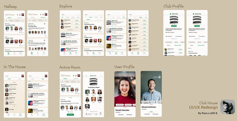
Based on this determination, I decided to split the interface into 3 main pages:
Hallway: containing ongoing rooms, curated based on the interest and followings. upcoming rooms also need to be added to the page.
Explore: allowing users to find new specific rooms, including finding rooms through clubs and people.
In the house: Allowing users to see other users or club which are online at the moment, and allowing user to join the room they are in.
Filtering option also found to be necessary in order to reduce clutter and to filter a rooms more specifically.
Navigation Journey
I took the ‘conservative’ approach in redesigning this app. As there are so many established app outside there, it would be prominent that people already used to a certain design language and ‘what is where’. Therefore, I would like to adopt the traditional multi-page social media app with bottom-page navigation bar for Clubhouse. I highly inspired by how instagram navigation layout in the redesigning process. This give users easy access to find rooms based on their intention at the time they landed. In addition, the active room would be my other main focus in redesigning the app.
Wireframing

Final Prototype


Try it on Figma
Play with the high fidelity prototype in figma. You can explore all the screens and interaction designs in this prototype. Enjoy! 🎉
Conclusion
This is the first social media app that I redesign. I learned the user journey in social media platform and how to create a user friendly interface. Club House is a new social media app with such unique user interaction and content, and it is very explorative practice to redesign this app.


Comments